Okay, let’s talk about visual brand elements and how they fit into your brand. As a creative entrepreneur, you’ve probably heard the term ‘branding’ thrown around all over the place. From having a personal brand to building out a brand for your business, it’s all a lot to remember — much less understand.
I’m a branding strategist by trade, and helping to design (and explain!) brands is a big part of what I do. Today, I wanted to give you a rundown of what exactly branding is, so that you know where exactly you should focus your time and energy. Whether you hire out a strategist or DIY your branding is up to you, but understanding the art of branding is key no matter what.
Here’s what you need to know.
What even is a brand?
Your brand is a representation of everything your business stands for, from your values to your mission to your story. To really build your brand, you’ll need to do some deep discovery work within your business to build a brand identity that reflects that. Once you’ve really circled a brand identity that makes you proud, you can start dealing with the beautiful elements of branding. I like calling that side of the coin the visual extension of your brand — think: logos, imagery, typography, and all of that good stuff.
However, there’s something essential to understand when it comes to building an effective brand. While lots of people (and maybe even you) tend to think of a brand as a logo, that’s not quite it. A successful brand has a solid heart and soul behind it, way before colors and typography come into the picture. When you make sure to add in backbone, you’re able to build a truly unforgettable brand… and that’s what matters.
The 5 Most Important Visual Brand Elements
By putting in the backend work that helps you define guardrails when it comes to your mission and your purpose, the visual extension of your brand is even more impactful. When it comes to working on the forward-facing pieces of your brand, there are 5 main pieces to the puzzle: logos, colors, typography, patterns or textures, and your image aesthetic.
Logo Design
We’ll start off with the big kahuna — your logo! Your logo is step one in building a recognizable brand and building out your visual brand elements, and it’s key to setting your business apart. Logo design is always best when someone who truly understands your vision helps your design, because logos are the most forward-facing piece of your brand identity. A great logo evokes an emotion, tells your audience who you are, and keeps you at the top of mind. You can also have big fun with logo variations, which can help you stay consistent all the way around. For instance, you might have one for your website, one for your email signature, and another variation for your marketing collateral.
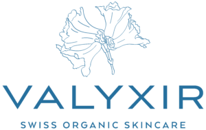
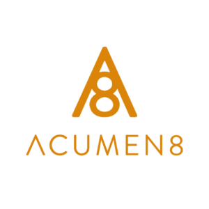
Here are some examples of logos I’ve done for clients in the past:


Your Colors
The colors you choose for your brand can make a big difference in your brand identity, and they’re an integral part of setting you apart. There are all sorts of psychological reasons for this (seriously: Google color psychology. It’s fascinating!), but color is also the piece of your brand that will set your customer’s mood, influence their purchases, and help you create a unique visual identity. I always recommend 4-6 colors in branding, which will give your website and collateral the room to move while still being recognizable.
One of my favorite ways to explain the importance of colors in branding is to get people to close their eyes and think of their favorite brands. Usually, you can instantly think of their use of color in your mind’s eye, from Coca Cola’s famous reds all the way to IKEA’s yellow/blue. Your job? To evoke that same recognition within your own brand.
Your Typography
Typography is one of those elements of branding that you forget about until you realize how dang important it is. Typography is, quite honestly, one of the most vital pieces of your brand identity — as a great type on your site or in your materials can be instantly recognizable. You’ll usually want at least 2 fonts that work well together (for your headers and then for any body text you have), and you’ll want to use them religiously and consistently.
When it comes to typography, I like to challenge people to do the same exercise as they did when thinking about colors. If you closed your eyes right now, I can guarantee that you’ll be able to imagine the fonts of the brands and apps you use every day. From Spotify’s bold font to Apple’s recognizable type, there’s something incredibly special about fantastic typography.
Patterns or textures
By integrating in patterns and textures with your brand, you can start to add personality and fun to your visual identity — and also allow for more space to move, shift, and create. From repeatable elements like patterns to unique feels with textures, this is where your brand can really resonate. Patterns and textures can also boost visual interest, help you to differentiate your materials, and let you play around with new things.
Patterns and textures are often the most looked over of the 5 visual brand elements in this list. If you’re having a hard time picturing patterns and textures in branding, you can think of Instagram’s color gradient logo, Target’s target pattern, and even the fun patterned insides of FabFitFun boxes. By adding visual interest in where you can, your brand can become instantly more dynamic.
Your image aesthetic
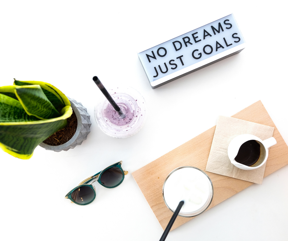
The last of our top 5 visual brand elements is your image aesthetic. One of the best ways to know you’ve designed an excellent image aesthetic for your brand is when someone sees a photo or image and instantly connects it to your brand. Whether you decide on a specific Lightroom preset for all of your photos or integrate brand photos onto your site that play with the same color palette, your visual aesthetic should always tell the story of your business. Your image aesthetic is also something that can be continuously updated to grow with your brand, and can be a great creative outlet.
There are tons of brands and people with incredible image aesthetics to draw from, whether the corporate style of Old Navy’s colorful, human-driven photos or the pastel, candy-cute aesthetic of Kate Spade. The mission? To have fun and to build visibility.
—
I know that building a brand you love (and that your audience loves) can be tricky, but it’s also one of the most important and exciting things you can do in your business. An excellent brand is exactly how you create a beautiful customer journey, and it’s also how you define yourself as the killer leader you are.
If you’re ready to uncover your ultimate brand, come join us in the Brand Brilliance Accelerator — a 4-month mentorship and group workshop experience built to help you create the brand of your dreams (and then scale it). Hellloooo, it’s a no-brainer! Hop on the waitlist here.