When people normally think of branding, things like logo and color scheme are oftentimes the first that come to mind. But while logos and colors aren’t what branding is all about, these are the visual elements that people tend to immediately associate with the personality of your business.
Colors are particularly effective in setting the vibe of your brand. A color scheme is a combination of chosen colors used to create style and appeal for a design. Doing a quick search on Pinterest will return palettes for almost any kind of theme (like this Tumblr, a must-see for any Wes Anderson fan), and that can be super helpful when accomplishing a cohesive look not just for your brand’s visual story, but also for projects like redecorating a room in your house or planning a wedding or an event. But the branding process is much more than using a pre-made palette that’s available to everyone else in the world.
When it comes to your brand palette, there should be an extra element of memory and storytelling that’s involved, things that can affect which colors jump out at you the most and the combinations you ultimately put together. Pulling from real life experiences can always serve as the ultimate inspiration, especially when you travel; it’s crazy to think that destinations associate themselves with palettes unintentionally thrown together in another era, or celebrate colors that resonate with the culture and people as a whole.
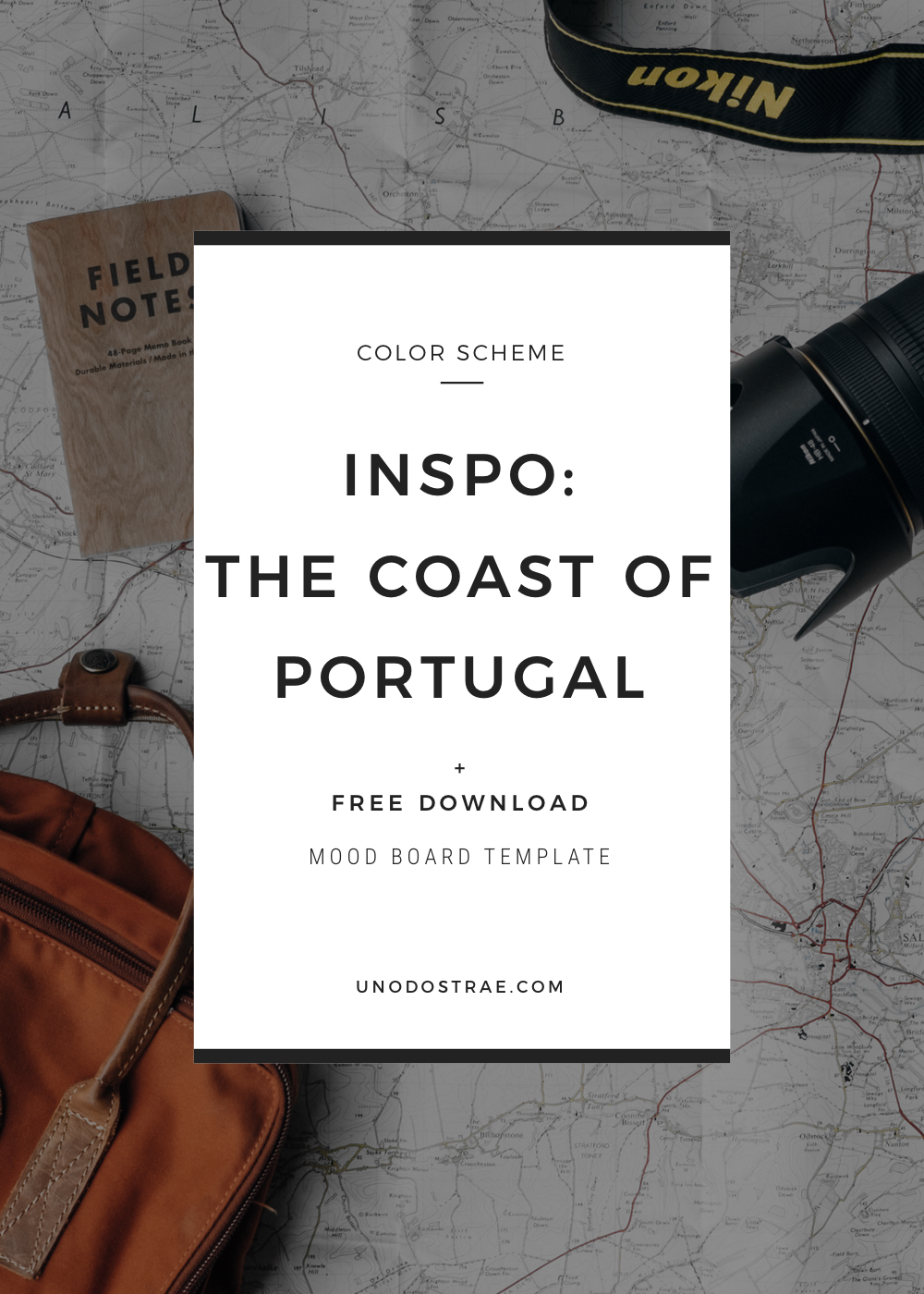
A Peek Into The Branding Process
Here’s a visual story that I worked on inspired by the coast of Portugal. To start, I pulled a photo I had actually taken on a recent trip to Cascais, a coastal resort town in Portugal, just west of Lisbon.
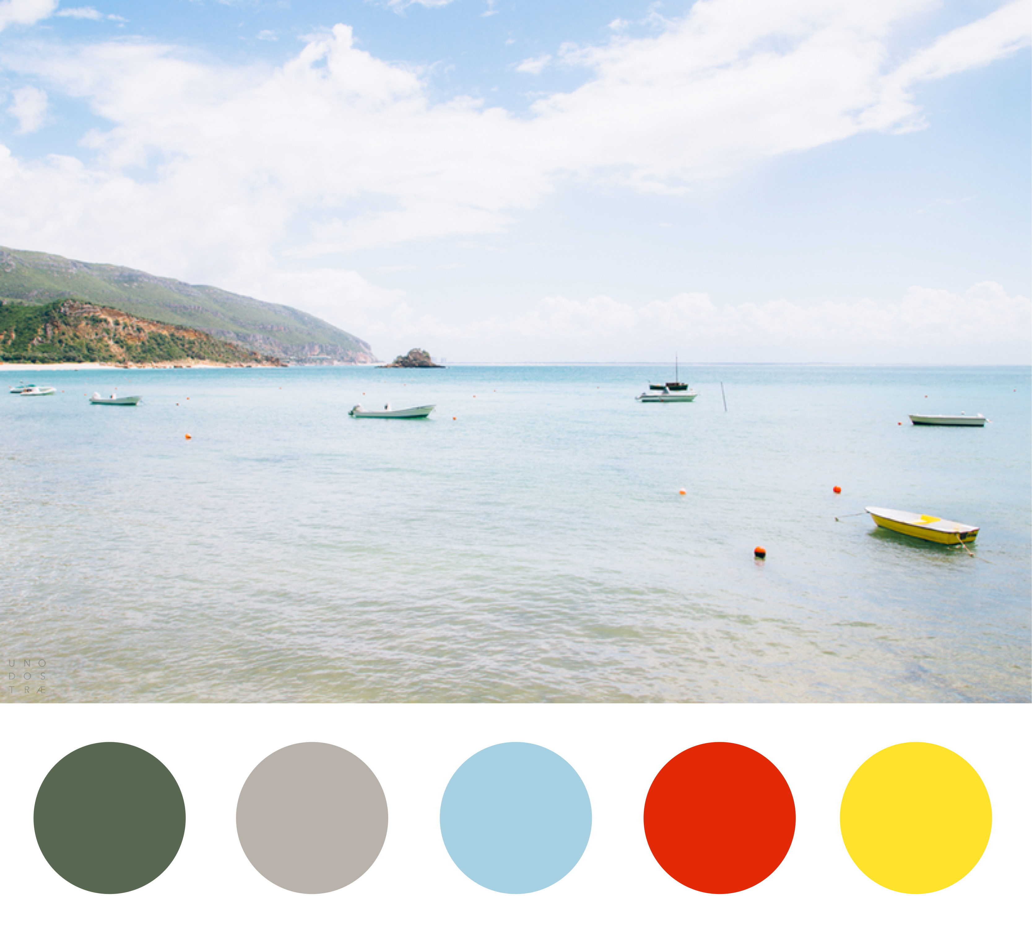
It was gorgeous that day and we drove about 20 minutes from downtown Lisbon to the coast. When I saw these boats chilling in the bay, I pulled over immediately. The range of blues in this scene between the sea and sky were enthralling, and I love how the sand closer to shore takes on more of a gray/taupe color. Also, the green from the mountains grounds everything nicely. But it’s the yellow rowboat and tangerine buoys that are the real showstoppers for me.
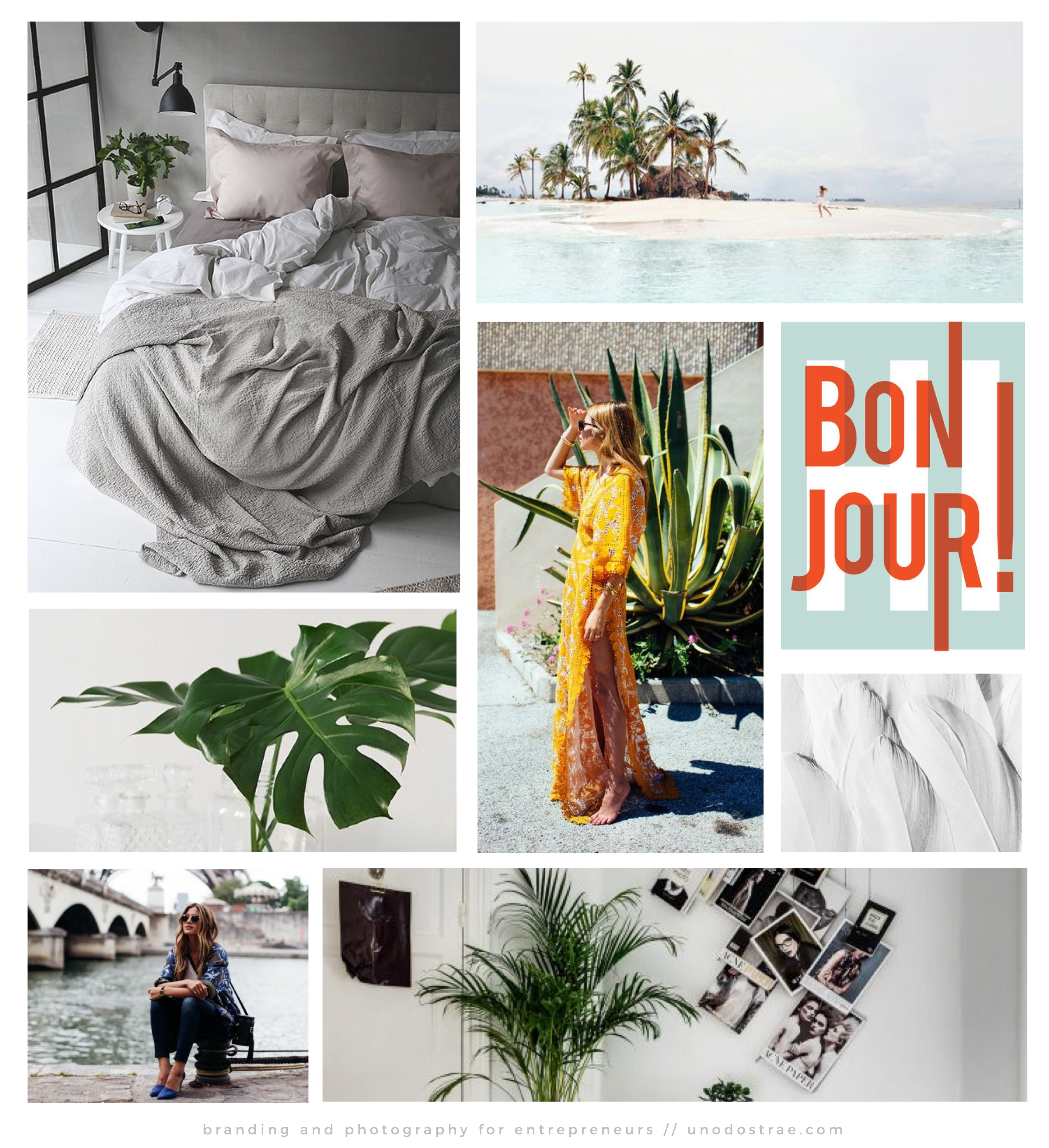
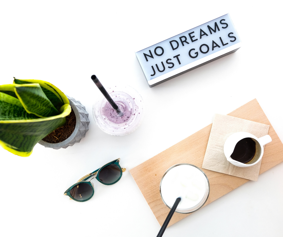
When it came time to test this color scheme and see it in action, I gathered inspiration and put together a mood board to see how the colors would work together from a lifestyle standpoint. I used gray and blue as my primary colors and incorporated that gorgeous green using plants. Finally, I made sure the yellow and tangerine red were doing justice to my board as accent colors. If you get tripped up on how much of each color to represent, try to (loosely) follow the 60-30-10 rule. Divide the colors into components of 60% primary colors, 30% secondary colors, and 10% accent colors. You’ll get a proper balance every time.
Creating color schemes can seem a bit intimidating. However, choosing a set of colors that resonates with your ideal audience and your brand essence is a key piece in creating a consistent aesthetic and building brand recognition and trust for your business. So experiment with colors and put them to work! I’ve included a free mood board template to get you started.
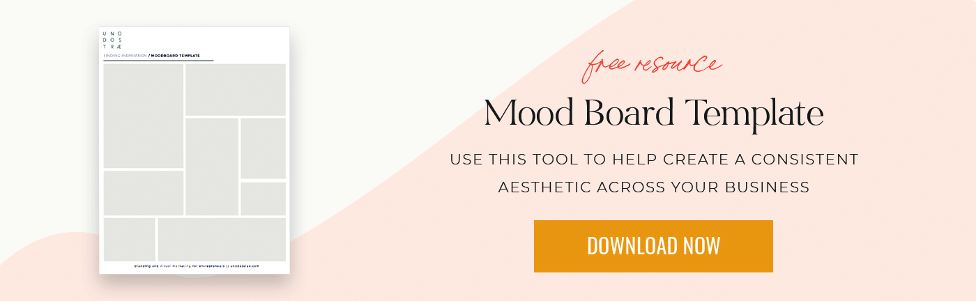
Download your free mood board here. Don’t forget to leave a comment and let me know how you do.