We all know the struggle of building our email list. And then the harder struggle of getting our subscribers to actually open those emails and click on your content. But contrary to popular belief, email marketing is not dead. It still reigns supreme as far as connecting with your audience, being able to effortlessly sell to them, and having ownership over your community.
Sure, getting your subscribers to open your emails is the first challenge. But for the ones who do, what kind of value are you providing them with inside your newsletter? Because, as with most things in our business, quality content can make all the difference.
You may have an amazing product to sell or a mind-blowing blog post to share, but if your email isn’t able to captivate your audience and keep them engaged, you might lose them for that next email you send out…and the one after that…unintentionally taking them all the way from warm lead (and prospective customer) to cold lead (who needs to be nurtured all over again) in only a matter of weeks.
That’s why your messaging and copy in your newsletter content is super important. But for visual brands, design can play a huge role as well. If the emails you send your mailing list are very image-driven and the design isn’t up to par or feels removed from your brand’s aesthetic, you ideal customers may not feel compelled to explore or engage further.
To help you out, I’ve put together a list of eye-catching email marketing designs and laid out what you can learn from each of them.
6 Amazing Email Marketing Design Examples
Kate Spade: A Friendly Hello
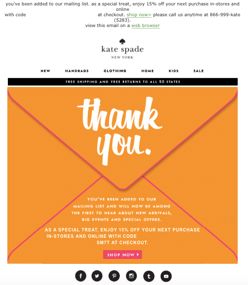
Take a page out of Kate Spade’s book. This stylish and simple welcome email is sent after you sign up to join their mailing list. This design is friendly and inviting and as with any great welcome email, there’s a call to action to really hook you: Shop Kate Spade’s online selection with a 15% discount.
Take Action: Create an automated indoctrination sequence (aka welcome sequence) for new subscribers who join your mailing list so you start nurturing them from the very beginning. Don’t forget to include a CTA in your emails. Whether it’s to take advantage of an incentive (i.e. discount or lead magnet) or to explore more of what you have to offer via your blog content, you want to condition your subscribers from the start to engage regularly with your newsletter content.
Apartment Digest: The Clean Cut Roundup
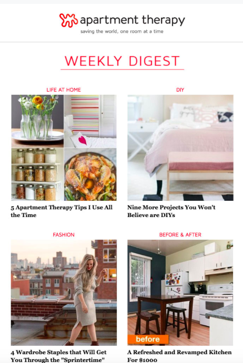
For businesses that revolve around blog posts or events, a weekly round-up is a great way to engage your subscribers. Make sure your layout is clean, clickable, and easy to read. Apartment Therapy lays out their recent posts in an easy-to-read grid format. Also, we always talk about how difficult it is to get your content in front of peoples’ eyes. Well, what better way to encourage more click-throughs than to send your weekly content straight to the inbox of your loyal subscribers?
Take Action: If you don’t have any content scheduled for a certain week, try scheduling a round-up email. You can list out recent blog posts that your subscribers may have missed or recommendations that you want to share with them. It’s an easy way to continue providing value and position you as a thought leader in your community’s eyes.
Kate Spade (Part Deux): Asking for Honest Feedback
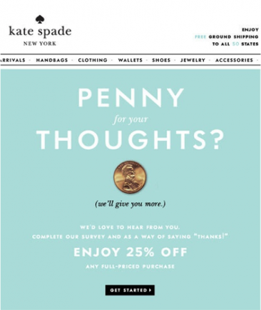
In this other email example, Kate Spade asks their subscribers to fill out a feedback survey. This is an awesome way to engage your audience and make them feel like your relationship is a two-way street. For increased responses, incentivize your subscribers by offering them something special in exchange for completing the survey and providing feedback. Some ideas could be an exclusive freebie, a Starbucks gift card, or promotional discount off your product (like Kate Spade does here).
Take Action: Surveying your audience for their insight and feedback is one of the most valuable things you can do as a business owner. See what other kinds of content they want to see from you or validate a new idea you have for a new course or program (after all, they’re the ones who will be buying it!). You can create a survey or questionnaire using Google Forms or Typeform. When you’re finished, include the survey link in your email with some compelling copy. You can also include an incentive to help boost engagement and participation.
Anthropologie: The Social (Media) Butterfly
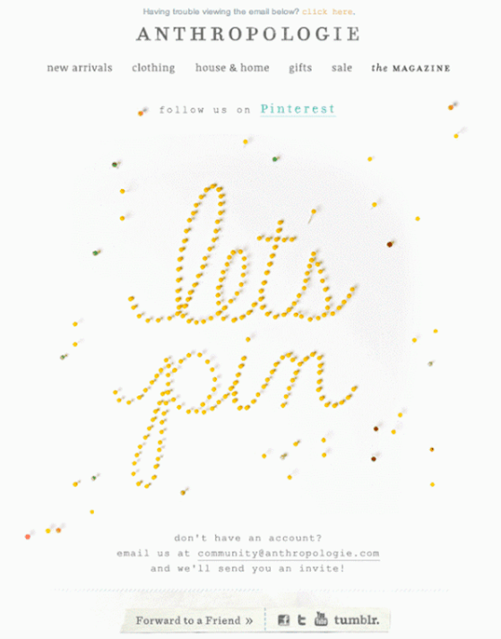
Here’s a thought: your subscribers may not even know you’re on Instagram, Facebook, Twitter or Pinterest. Build up your following across all platforms by cross-promoting your links to your social media accounts in your newsletter content. Try making it the main attraction in your campaign, like Anthropologie did with this email.
Take Action: If you have a product-based business, a simple design like Anthropologie’s example may be enough. But if you’re a service-provider, consider providing more context for your audience; let me know what other kinds of content they can expect from you if they also follow you on Instagram and Pinterest. Either way, don’t forget to provide your social media links or include strong CTAs.
Monica Vinader: Product Photography Takes Center Stage
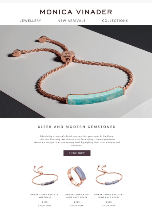
Do you have an amazing visual brand? Your emails are the perfect place to share your visual content with your audience. Using your own brand imagery is an impactful way to make your email marketing content feel more unique and personalized. Monica Vinader, a New York City based jewelry company, uses their product photography as the main attraction in their email marketing. If you sell a product, this is a perfect time to make sure your goods take center stage in peoples’ inboxes.
Take Action: You don’t even need a photographer to start taking your own brand imagery. If you have a real camera, use it! Or even utilize the camera on your phone and these photo tips. Don’t have the means or time to create original visual content yet? On-brand stock photos can also fulfill your branding needs (check out Unsplash, Stocksy, Haute Stock, and Social Squares).
Flume: Exclusive Announcements
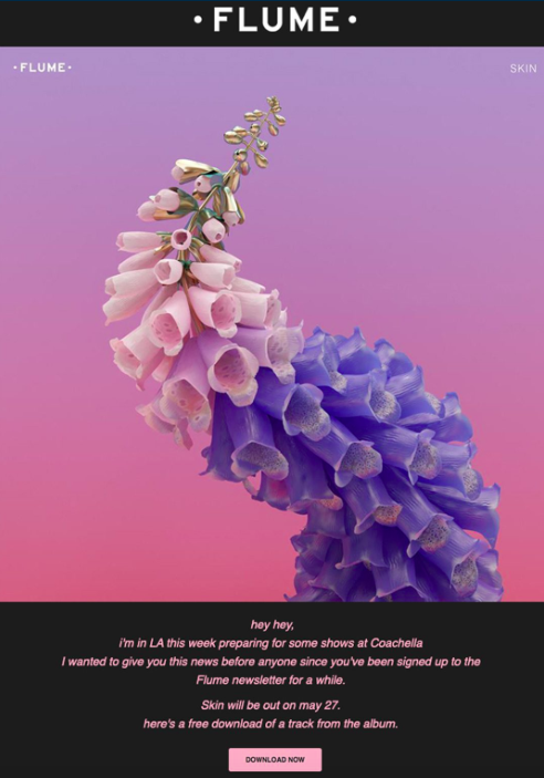
Another smart strategy for email marketing is to highlight a level of exclusivity with your community and make your subscribers feel like they’re part of a special group. Award-winning electronic dance music artist Flume pulls this off beautifully. His emails always feature a big stunning image, with some copy about what he’s been up to, when he’s going on tour, or when his next project is being released. Flume gives his fans an exclusive, tailored update about what he’s doing in this email. On top of that, he gives his subscribers a strong call-to-action to download his newest singles for free. As a result of Flume’s stellar email marketing, his list of subscribers grew by 2,420%. That’s some serious growth!
Take Action: Your community is one of the most important aspects of building your business. If you treat your subscribers like they are the most important part of your brand, then they will always come back for more of your content or products. Give them glimpse into your life, share what goes on behind-the-scenes, or let them be the first ones to try out one of your products or courses and they’ll feel like VIPs.
Major Takeaways
When if comes to building a community, your email list is sacred. It’s immensely important to treat it like gold. Nurture your subscribers from the beginning with a welcome email, set up meaningful interactions to keep them engaged, offer them product discounts and special content, and pull them in with exclusive content reserved for only your list accompanied by stunning imagery.
If you’re new to creating content for your audience, start small. First decide which platform you’ll create content for (where does your ideal customer hang out? Is it your website? Instagram? YouTube?). Next, commit to creating one blog post a week or every other week—whichever feels more sustainable to you—and then start promoting and sharing that with your mailing list. Or if visuals are more your thing, get in a cadence of shooting your own brand photography or creating your own visual graphics to beef up your website and Instagram feed with (and then share with your mailing list). If you’re shooting your own brand photos, you can use my Smarter Edits Tracker tool to help you streamline your editing style for a more consistent aesthetic across your imagery.
Have any amazing emails in your inbox lately? Share any tips you’ve learned in the comments below.SaveSaveSaveSave

